From Local Lore to Household Name
From Local Lore to Household Name
From Local Lore to Household Name

Info
Info
Branding, Web Design
User Experience, Information Architecture
Description
Description
A greenfield design focused on expanding the customer base and establishing an online presence that matched the charm of the brick and mortar location.
work done
work done
User Interviews, Competitive Analysis, User Personas
TLDR;
Sheafe Street is a small bookstore with a loyal local following but struggled to gain new customers due to a lack of an online presence
With a user base spanning 50 years, their design had to be both modern and familiar. We used a color palate indicative of the inside of the brick and mortar store and kept site structures uniform with other more widely known industry competitors
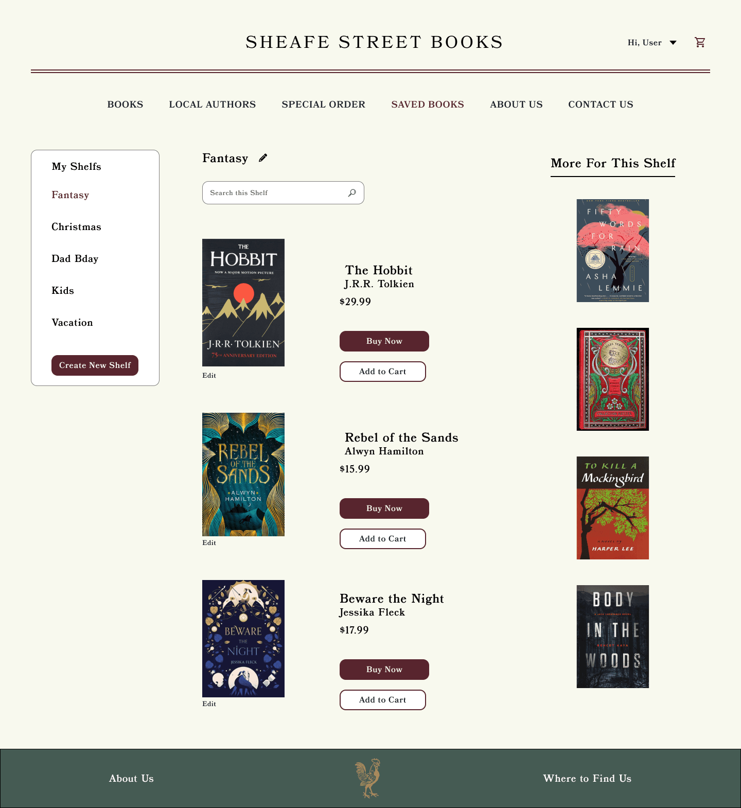
Interviews with current and prospective users showed a desire to see product availability before entering the store.
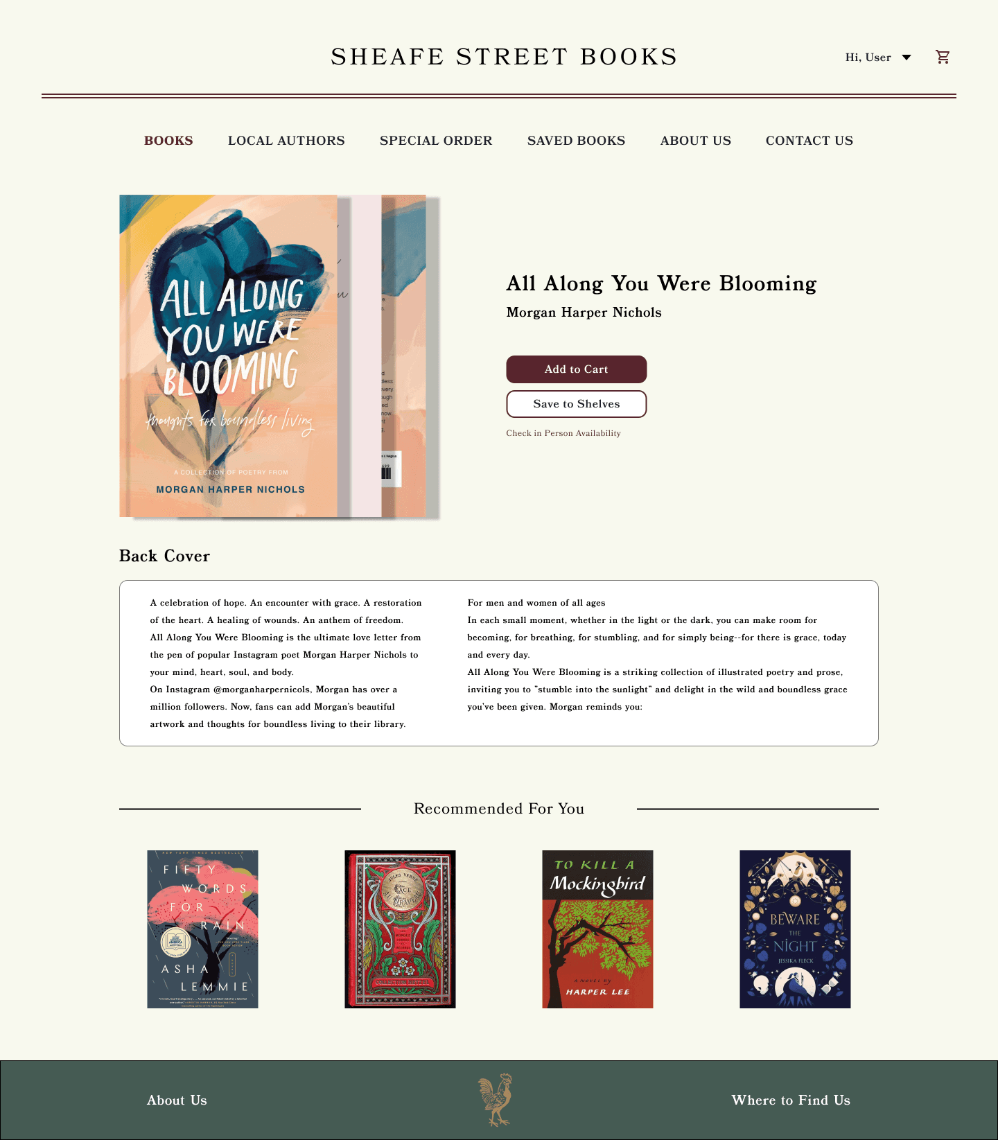
A "Special Order" page was added for books not carried in person as well as for more inclusive editions such as large print books
SHEAFE STREET BOOKS
Tucked between dive bars and bakeries in a small New England city is a quaint, unassuming bookshop run out of the owner’s own living room. Sheafe Street Books is the local’s choice book store in Portsmouth, New Hampshire with a quiet charm that has kept it the city’s best-kept secret for fourteen years.
Tucked between dive bars and bakeries in a small New England city is a quaint, unassuming bookshop run out of the owner’s own living room. Sheafe Street Books is the local’s choice book store in Portsmouth, New Hampshire with a quiet charm that has kept it the city’s best-kept secret for fourteen years.
As lead designer on this project, I aimed to introduce new users to Sheafe Street by creating an online presence that represented the store’s authentic appeal while modernizing and improving existing brand aesthetics.
As lead designer on this project, I aimed to introduce new users to Sheafe Street by creating an online presence that represented the store’s authentic appeal while modernizing and improving existing brand aesthetics.

GOAL
We set out to create a site that felt familiar and cozy, highlighting all the quirky aspects that the locals appreciate and making Sheafe Street’s online presence feel as authentic as it's brick and mortar location.
In doing so our goals were to…
We set out to create a site that felt familiar and cozy, highlighting all the quirky aspects that the locals appreciate and making Sheafe Street’s online presence feel as authentic as it's brick and mortar location.
In doing so our goals were to…
1.
1.
1.
Expand Sheafe Street's customer base
2.
2.
2.
Increase current customer satisfaction

RESEARCH
Appealing to the masses
My research showed a wide age range in Sheafe Street’s user base with customers aged between 18 and 65 years old. This meant that my design had to be engaging and comprehensible to a wide scope of digital literacy. To ensure this I…
Kept Icons Familiar
I chose icons users would recognize across websites and real life (shopping carts, edit pencils, and trash cans) so would be quick and recognizable for users of all ages and backgrounds.
Utilized Legible Font
We went through a couple iterations before deciding on a font that matched Sheafe Street’s aesthetic while still remaining clear and legible.
Followed site structures that matched most users’ mental models of other bookstore websites
I familiarized myself with well-known competitors and created an optimized layout with similarities so that users were instantly accustomed to the site structure.
Prioritized quick navigation to the inventory, clear headers within the navigation bar, and obvious breadcrumbs
The navigation bar options were prioritized so that inventory was immediately available to users when they arrived on Sheafe Street’s site. Much like when you walk in the door at Sheafe Street, users should quickly feel as though they are surrounded by shelves of books, comfortably browsing for their next read.
The original design utilized a font with a heavier standard weight but offered no option for a semibold or bold weight. This proved difficult when trying to create hierarchy, especially in the navigation bar.
The original design utilized a font with a heavier standard weight but offered no option for a semibold or bold weight. This proved difficult when trying to create hierarchy, especially in the navigation bar.
We pivoted to a new font with a similar style that allowed us to use it’s bold weight to clearly display where users were on the site and create hierarchy among elements.
We pivoted to a new font with a similar style that allowed us to use it’s bold weight to clearly display where users were on the site and create hierarchy among elements.


A conversation with the locals
Through user interviews, both simulated and in person, I gathered insights into the needs and desires of current and prospective users.
90% of all interviewees said they use the Internet when trying to buy a book or find a place to buy a book.
With one user stating, “...when I’m on the hunt for a physical copy, online is where I find local stores or the best deals. The convenience of browsing from home and comparing prices just can’t be beaten”
When asked about their ideal online book-shopping experiences the most common responses included
Access to inventory availability online
Options to save books for later
Special ordering for specific editions or copies of books
DESIGN
So much of Sheafe Street’s draw is the feeling of being invited into someone’s home, so it was imperative I translate that to their website. I bridged character and modernism by using fonts and colors representative of Sheafe Street alongside contemporary layouts and main lock ups that fit into the modern day users mental model of a bookstore website.
So much of Sheafe Street’s draw is the feeling of being invited into someone’s home, so it was imperative I translate that to their website. I bridged character and modernism by using fonts and colors representative of Sheafe Street alongside contemporary layouts and main lock ups that fit into the modern day users mental model of a bookstore website.
My color palette used warm, natural colors representative of the inside of the store.
I utilized real pictures of the shop and the owner often and used language throughout the site to remind users of the small scale of operations.
I highlighted the fact that users were shopping local with CTAs and confirmations that emphasized that fact
OUTCOMES AND REFLECTION
Loyal Local Turned Designer
Designing for Sheafe Street Books was an incredible lesson in taking a strong existing brand and translating that into an online presence. While balancing the needs and desires of both users and stakeholders I was able to create a design that felt uniquely authentic yet familiar.
This project tested my ability to remove myself from the design process and make decisions based on the user’s and the owner’s needs. Having spent many afternoons among the shelves at Sheafe Street, it was easy to get lost in my own predispositions. Taking a step back and regarding myself as a designer rather than a user taught me what I think may be one of the most important lessons for me as a junior designer. It’s not about me.
Moving Forward
Though Sheafe Street isn't live yet, there are many ways to measure success once launched. Close attention will be payed to the number of users creating an online account, increases in in-person sales and tracking of online sales, as well as increased foot traffic to the store location.
As we look toward launching this project there is much more reflection and ideation to be done. Some ideas for future projects include incorporating a reading tracker where users can log books they’ve read, create reading goals, and leave reviews. I also would like to broaden the filter options to include sub-genres and varying book formats, as well as create a community page to host book discussions and plan events.